


The Art of the Artists' Business (Fan) Page Banner
I've seen several social media sites highlight the creativity of businesses/designers and their Fan Page Banners, but meshing current product or service online-marketing-helps with my own fine art marketing needs isn't always obvious or even a good fit. I know a few basics such as:
#1 The profile-icon on your art business page should show your art (see 5 Actions to Rock your Facebook Page by Art Biz Blog).
I am often surprised over how many artists I come across who do not do that. A quick search on FB will show that it is your profile-icon image that is displayed, and not your banner. If someone is browsing, I am not at all confident a photo of myself would garner a click -- though perhaps a self portrait in the style of my work would be a different story.
After several hours of browsing through Facebook I was able to find 22 variations on banners for Artist Business or Fan Pages. You will notice that each example offered in this list shows work by the artist in the profile-icon. Click on the name of the artist to go to their website - Click on the image to go to their Facebook page.
Lets have a look!
1. Chas Jacobs - "Chas draws his inspiration from the North West of England; as well as from his holidays in Devon, where his interest in boats, and the sea are reflected."
I found this to be the most popularly used banner/profile-icon combination: single image work + single image work (may or may not be cropped). In this case the profile-icon matches perfectly with the banner through colour and the artist's distinct style. For some reason that is not always the case, and the banner turns out to be more of a surprise; somewhat disconnected from the profile-icon -- which is a turn off for me as I then feel somewhat confused over what to expect from the artist's page.
Additionally, the description of Chas Jacob's art complements his image choices. One quickly gets a good introduction to Chas' work.

2. Duo Otavio and Gustavo Pandolfo, known as Os Gemeos
Slight variation from above by creatively collaging multiple images of work for the banner. I especially like the blend of 2D, 3D and interior space. Again, the profile-icon and banner go well together (four repeated yellow faces).

3. Soon
I really can't tell you much about this page as the translator failed. I included it as another variation of the above which instead used a grid layout of multiple images, both of 2D artwork and interior spaces. The profile-icon matches banner artwork, and is an intriguing & amusing choice showing the back of the head of the fox. The addition of a single word is also eye-catching and interest building.

4. Nick Gentry - "creates floppy disk paintings and art from the obsolete technology of society"
A successful profile-icon which combines artist with working on a piece. (Love the artist profile with subject profile!) The profile-icon and banner are in keeping with the description and connect to each other through subject matter. I am not certain if the banner is part of a finished piece or is a collection of items he uses to create his work, but either way it works!

5. Alan Dent - Personal page (I could not find out more about his art without becoming a "friend.")
I've included it because I think it is very appropriate for an artist's timeline page. Plus it is intriguing. Who are all those people and are all those paintings his? And if so, why are they all holding one?
If those are all his works then the combination of his profile-icon and the banner work, on both types of pages. (But preferably, he would have a business page that focused on his art, allowing his personal page to be a broader interest arena that wouldn't detract from his art.)

6. Deborah Burt - "The challenge to capture an animals character is one that I particularly enjoy."
I really appreciated those sculptors who showed themselves working on a sculpture in their profile-icon. When I came across this I wondered if I would see a horse sculpture in her banner. I was pleasantly surprised to find that she had actually placed the sculpture among live versions of her subject. Bonus: the perspective of this photo draws you in squarely to the sculpture, like a bullseye!

7. Joe Fenton - "Joe Fenton is a London based artist that works mainly in monochrome. His large drawings are produced using graphite, ink and acrylics on paper."
Switching from artist working on a piece in the profile-icon to artist working on a piece in the banner. Great photo of work in progress which includes just enough of the artist to show scale and add interest. The profile-icon is intriguing, featuring one big eye, and is a complement to the banner. (Lovely arc line of eyes from profile-icon through banner).
Description and artwork match, but you do have to click on About to get to description.

8. Tim Ganon - (no description available)
A variation on the artist working on a piece in the banner image: additonal works viewable within an interior studio/gallery space. Profile-icon subject repeated in banner. Website and brief description added to banner. (Text on banners not to exceed 20% of image - more on that later.)

9. June Korea - (No description available)
A more formal gallery space style banner image, without artist presence. Profile-icon subject repeated in banner. Minimal text on banner with website.

Larger area of studio/gallery displayed in the banner image. Black and white banner showcases and compliments the delicate colour of the profile-icon.

11. Christian Chapman - "Portraits - Ocean Art - Musicians - Actors - You & Your Fave Musician Painted Together!"
Profile-icon a self portrait? Perhaps. Perhaps not, But perfectly in keeping with the work portrayed in the banner image. Nice muted interior shot showing scale in more of a "interior design" style as opposed to studio/gallery style.

12. Julia - "I paint the natural flow of spiritual energy that exists all around us, helping you to connect to its healing powers."
Another popular banner/profile-icon combination shows artists alongside their work, but not actively working on their work. Julia's banner is similar to the work shown in the profile-icon. I also like that Julia's page identifies the type of artist she is - "energy artist"

13. Tracy Kobus - "Tracy explores the powerful imagery of Canada's westcoast in her imaginative painting style."
Another variation of artist with work shown in the banner.
There is a lot to like about this combo: the rule of three in the box shapes, the "empty" window box indicates possibilities, the whole is uncluttered, warmth is portrayed through the fire in the profile-icon and suggested/repeated with the expression on the face of the artist and the white of the window. To me this combination captures that this artist is passionate about her subject.

14. Phillippe Fernandez - "fairy tale artist"
Great choice of profile-icon, you pretty much get "fairy tale" right away. The text in the banner appropriately designed. Interesting collage of artwork, published work, and artist.

15. Ian Gamache - "Drawing is one of our oldest forms of communication, and it can still be very relevant today, even as the world becomes both a faster and a smaller place."
The artist wearing a mask of his art. Like! Enjoying the repetition of line & colour between the profile-icon and the banner, too. Effective in parts and as a whole. I wish some of his description was on the main page though.

16. Agnes Cecile - (No description available)
Another artist wearing her art. Minor difference is that she painted directly onto herself. The profile-icon works as the painting style is similar, and the subject of the banner & profile-icon are the same. Further interest is created with the contrasting circle/triangle shapes.

17. Andre Dahmer - (No description available)
I came across a few artists who included their tools in their images, but usually they overdid it (more tools than art) or the interest factor wasn't there (everyone knows a painter uses a paintbrush). Comic artist Andre combines both his art and his tools (pen/paper) perfectly and appropriately in his banner image. The mug profile-icon did well to suggest writer/drawer to me so I clicked through and found this humorous banner.

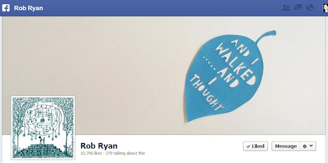
18. Rob Ryan - "widely known for his intricate papercuts"
Rob's description is hidden (IMO) on the About page, so his banner does a pretty sharp job of indicating what type of art Rob makes. The detail of the profile-icon contrasts with the single large shape of the paper leaf in the banner for added interest, yet connects through subject.
19. Carlo Mirabasso - (Description in Italian)
What I like about this is that Carlo's profile-icon says it all. I know his name, what his work looks like, and that he paints it. I didn't know it was possible to have text read so well on such a small image. Now I know. Thankfully, the banner showed work in the same style.

20. Ellen Stapleton - "Her work is inspired by her love for street art, tattoo design and nature; and her travels to exotic locations around the world."
Ellen has used her design skills to create an announcement banner. How can you find out if you are following Facebooks 20% text rule? Use this Handy Tool at www.marismith.com Mostly, I like the merging of her art and text.

21. J. Scott Campbell - "comic book artist best known for his work on 'Danger Girl', 'Spider-Man', 'Gen 13', 'Wildsiderz'"
Does it all count as text? :)
Great use of text with image. Profile-icon fits perfectly. Fun way to celebrate an event/accomplishment.

22. Steve Caldwell - "UK-based portrait painter and illustrator specializing in portraiture and contemporary realism."
Obviously this is over the 20% rule, but no doubt it could be modified to fit. This one is more of an idea generator, always a good note to end on!

Do you have a creative Facebook Artist Business Page? Please submit it with your comments. Your contributions could make this a great resource.
Or do you know of another resource for Artist Business/Fan Page banners? Submit that as well. All help appreciated.
Yes! I can be found on Facebook at Col Mitchell - Contemporary Paper Artist.
I have mixed up my banners from time to time under examples #1 and #3, but I definitely plan to branch out following some of the other examples. Hope you do too!

Great post and great ideas (and your work is amazing!)! Here is mine:
ReplyDeletehttps://www.facebook.com/daggiwallacestudio
I used a collage as my profile icon because it will show up in more places than the cover pic, but the cover pic ties in because it's the same style and the same model that is featured large in the collage. I'd love to know what you think. Thanks!
Thanks for this thorough post, Col - and the timely reminder to update my fan page banner!
ReplyDeleteThanks for visiting Ruth, and you're welcome! I popped by your blog and FB page, love your tag line "celebrating a wonderful world in stitch." Your textile paintings are full of life!
DeleteThanks, Col - I did my 'homework' and updated my banner with a photo of a work-in-progress (http://www.facebook.com/RuthdeVosTextileArt). I chose this with the thought seeing it crumpled under the sewing machine might help people to visualise the scale, feel and texture of the work a bit better. Your post has reminded me to change this image over more regularly.
DeleteMission accomplished! Great reminder of the skilled work that is involved in your pieces too. Thanks for posting this!
DeleteDaggi, your pastel portrait work is fabulous! The lighting is stunning. Great job IMO on having your banner and profile icon makes sense together. Pretty impressed you got all those images into your profile icon PLUS Text. Hope you got some good ideas here. Thanks so much for sharing yours!
ReplyDeleteThanks so much, Col! Yes, your blog is great and very inspirational, thanks for sharing so much!
DeleteOh, by the way, I created that collage of images with text that I use for my studio profile page on ipiccy.com, saved it as a jpg and was amazed myself how well it worked even though it's so small.
DeleteGreat resource share! Thanks Daggi!
DeleteCol, Great article. Very helpful. I'm amazed at and rejoice in the thousand of likes some of these artists have. Wow! I went and made some changes to my FB site based on your article. Thank you!
ReplyDeleteGlad to hear this was helpful. Yes, some of those artists had an amazing amount of likes. You are welcome to come back and share your FB page!
DeleteThis comment has been removed by the author.
ReplyDeleteGreetings! This is Roopa the Chess Artist here. Congratulations for posting the most visually helpful post for us Artists. I really enjoyed watching so many Artists and their FB Banners. How did you find them all? I only get to find them when I am looking for something else and see their post on someone else's page. Thank you for sharing your post. http://www.facebook.com/Roopa.Dudley.Paintings
ReplyDeleteHi Roopa I love working to themes. Are you a chess artist exclusively? or Are you working on a big project surrounding chess? To find all of these artists I searched FB for: Art, artist, painting, sculpture. These were not that easy to find. I know I will keep coming back to this post for ideas for my own page.
DeleteGreetings Col Mitchell! Yes. I do consider myself to be an exclusive Chess Artist. However, I also do comissions which affords me to be the Chess Artist and those comissioned pieces rarely have Chess Pieces in them (although they should - wink). I also have Masks in majority of my paintings. You are most welcome to visit my Art Blog if you like to get a better feel to see what I do. Thank you so much for introducing us to all these wonderful and amazing Artists out there. http://roopadudley-artblog.blogspot.com/
DeleteSo very interesting... I could see your work in children's books easily; engaging colours & patterns, with strong stories woven in. Thanks for sharing!
DeleteCol, this is so thorough, thank you. I look forward to studying it further. Meanwhile, here is mine which has a detail and my logo in the banner, photo of me by my art as the icon.
ReplyDeletehttps://www.facebook.com/KathleenOBrienStudio
Thank you Kathleen! You look like a '12' to me :) Love your work! Adore the whimsy, details and colours, it is so... musical!
DeleteThis comment has been removed by the author.
DeleteGreat article; informative, clear, concise, easy to read and lots of variations on the theme, which I especially enjoyed...something for everyone but all points to what you are trying to convey. Another point, is the secondary pop-up of the banner/timeline/profile pic under albums...the flow there always is something I consider but find frustrating because, I agree wholly with what you are saying about the profile & banner complimenting one another...but there is also the timeline 'flow' to consider too...I've had feedback - personally and thru watching my insights, that my own friend/fan base tends to share more pics I post that have 'action' in them then stationary photos of my pieces...I've had more positive feedback thru event related pics of my art and me with my art AT events...does that make any sense? soooo I alternate between the first 2 u explain and the 3rd option I've been asked for more of. and NO CATS. (smiling) J <3
ReplyDeleteIf I get what you are saying about "banner/timeline/profile pic under albums" then by that time they have seen your page before they have gone digging for more goodies to enjoy.
DeleteI agree with what you are say regarding timeline posts. And that is the perfect place for a mix. Great that you know that. LOL re cats.
Wish you had left a link to your page :) You are welcome to come back and do so.
Here is something that I discovered about how I interact with an art page:
1st: The profile icon catch needs to catch my eye. Because that is the main way I will be introduced to a page
2nd: When I go to the page am I impressed, or confused?
3rd: I'll read the description for clarification or additional information
4th: Impressed? Guaranteed I'll scroll down first before even considering clicking a link. If I don't see 3 or 4 more examples of their work in about 3 seconds of quick scroll my interest has dipped significantly. And by "more examples of work" I do not necessarily mean still shots, I'm just more interested in their work and items related to it, than I am of anything else (which is distracting IMO, a.k.a cats, and not why I am there)
Impatience comes quickly online unfortunately :)
Thanks for commenting. Appreciated!
Col, thanks for the inspiration to actually, finally, DO something with my FB Fan page. I plan to work on it over the next week. Yay, you! :-)
ReplyDeleteBanner first, then I'll start planning better content . . .
You're very welcome! YAY you!! :)
DeleteWhat a great resource! Thanks for all the effort you put into the resarch and for sharing it!
ReplyDelete